THE UK'S LEADING SAME DAY PRINTER!
Colours
Colours can behave very differently on screen compared to how they appear in print. This guide explains why that happens and how to prepare your artwork for the best possible results.
RGB vs CMYK – what’s the difference?
Computer screens, phones and tablets display colour using RGB — Red, Green and Blue. These colours are created using light.
When red, green and blue light are combined at full strength, they create bright, vibrant colours — and even pure white. This is why colours often look much brighter on screen.
Printing works very differently. Printers use CMYK — Cyan, Magenta, Yellow and Black — which are inks applied to paper.
Ink absorbs light rather than emitting it, so some colours simply cannot be reproduced as brightly as they appear on a screen.
Why colours change from screen to print
Because RGB uses light and CMYK uses ink, a direct conversion is never perfect. Bright blues, greens and neon colours are the most affected.
If you design in RGB, our system will automatically convert your artwork to CMYK and show you a preview before printing. This preview is the best indication of the final printed result.
Pantone & spot colours
Pantone (spot) colours are special, pre-mixed inks used mainly in high-end or brand-critical printing.
Standard digital printing does not use spot inks. Any Pantone colours in your artwork will be converted to CMYK.
For best results, we recommend converting Pantone colours to CMYK in your design software and checking the appearance before upload.
Using black correctly (rich black)
Using 100% black (K) alone can sometimes appear flat or grey, especially on large areas.
For deeper, richer blacks, we recommend a rich black (“shiner”) mix:
- Cyan: 60%
- Magenta: 60%
- Yellow: 0%
- Black: 100%
This produces a darker, more solid black when printed.
Avoid using rich black for small text — small text should remain 100% black for clarity.
Visual comparison
These diagrams illustrate how screen colours differ from printed colours.
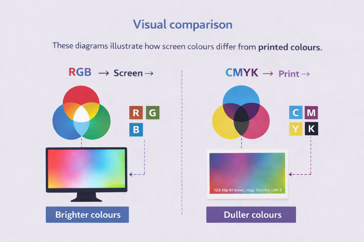
On screens (RGB), colours are created using light, making them appear brighter. In print (CMYK), colours are created using ink, which absorbs light and appears more subdued.
Key points to remember
- RGB uses light — CMYK uses ink
- Printed colours will always appear less bright
- Always check your proof before approval
- Pantone colours will be converted to CMYK
- Use rich black for large dark areas